Cosmetic changes
Posted by David Zaslavsky on — Edited — CommentsId: 51
Last week — at least I think it was last week — I made a really huge functional change to the website, probably the most significant change since I changed all the code from PHP to Python in the first place. But although that change, the new chained handler architecture, made the behind-the-scenes work significantly easier for me, it really didn’t look any different on the surface; in fact, you would be forgiven for thinking that the overall look of the site was dark and gloomy and frankly, rather unattractive (I certainly did). And from a visitor’s perspective, an attractive website is a good website.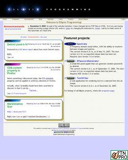
So today I present the long-overdue cosmetic companion to last week’s functional update. I’ve actually been planning this theme upgrade for well over a month, and originally I was going to make more drastic changes, but after spending the past couple of weeks thinking about it I realized that most of the site design wasn’t actually that bad. After all, I’d already made a nice textured background for the site and introduced the nifty rounded rectangle borders for blog posts, and reducing the area taken up by the announcements (at the top of the page) definitely helped the look. That was my main complaint, actually, that the “banner information” which is common to several different pages was taking up most of the viewable area, crowding out the content. Google has long been considered the acme of web page UI design and they are relentless about clarity and open space. So I decided to take a good hard look at where I could rearrange things to use the available space more effectively.
To that end, I replaced the old solid black banner at the top of each page with the nifty new blue banner you see above — it’s better on three counts, (1) more colorful (2) more curves (3) smaller/less intrusive. It also makes room for the menu to move up to the right, so that doesn’t get in the way. Also, on the program pages, I did basically the same thing by moving the current version indicator and the program page navigation links (“Home”, “Access”, “Development”, etc.) up to the right of the logo.
Part of my goal for this redesign was to integrate the TextWriter page with the rest of the site, not only by making it look the same but by making it use the same templates and common data structures, so, for example, announcements would show up on the TextWriter page as well as on every other page. TextWriter currently exists as a Java web application served by Tomcat; it’s a completely separate system from the rest of the site, and that makes integration pretty difficult. Sure, it can integrate with itself pretty well (that’s how the submission form could change itself to always display the latest image you created), but once I started recoding parts of the application, it would be difficult to hook them together without using AJAX. Which is great, because I was thinking about doing that anyway (repeat after me: AJAX = Chocolate = Happiness). So I created a new TextWriter web page, complete with an asynchronously-updating nicely-laid-out form-in-a-table, and since I’d have to rewrite a lot of the Java code anyway, I dropped it completely in favor of the fantastic and very powerful ImageMagick tool suite. This allows a lot more room for expansion and addition of new features in the future, with much less work on my part. This can only be a good thing.
Anyway, enjoy the new look! Comments, if you have any, can be attached to this post, or emailed to me at contact@ellipsix.net.
P.S. Almost forgot: the change in name from “Ellipsix Programming” to “Ellipsix Informatics”. This simply reflects the fact that there’s going to be less software distribution and more assorted . . . stuff from now on.