Getting closer to the elusive Higgs boson?
Posted by David Zaslavsky on — CommentsOne of the neat things about being at the CTEQ school last week (more on that in an upcoming post, by the way) was how the representatives from ATLAS and CMS, the two major detectors at the LHC, kept hinting that they’d be releasing some really interesting results at the European Physical Association’s HEP-2011 conference conference this week. Well, it looks like the cat is out of the bag: both detectors are already reporting an excess of events at \(2-3\sigma\) significance around \(\unit{120-150}{\giga\electronvolt}\) in the \(h\to WW \to ll\nu\nu\) decay channel.
What this means, in short, is that the number of times they detected two leptons (\(ll\)) and an amount of missing momentum that corresponds to two neutrinos (\(\nu\nu\)) exceeds the theoretical prediction when the total energy of the leptons and neutrinos is between roughly \(\unit{120}{\giga\electronvolt}\) and \(\unit{150}{\giga\electronvolt}\). This is the sort of thing we would expect to see if the Higgs boson has a mass somewhere in that range, around \(\unit{135}{\giga\electronvolt}\). Of course, it could be a fluke; that happens fairly often, because the way particles interact is essentially random, and sometimes you see more of a certain kind than you expect simply by pure chance. In this case, though the difference between the prediction and the actual result is large enough that there’s only a 1% chance of seeing what we’re seeing if a Higgs boson with a mass \(\approx\unit{135}{\giga\electronvolt}\) doesn’t exist. So a theory which predicts that the Higgs does exist with that mass might be a better explanation of the results ATLAS and CMS presented today.
Of course, nothing cuts through the statistical mumbo-jumbo like some pretty pictures. Here are some representative plots, direct from the EPS presentations (click each to go to the original presentation PDF):
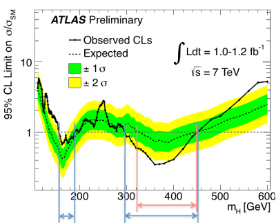
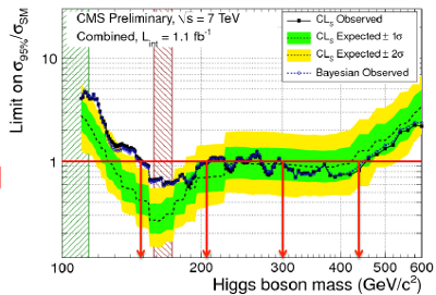
In both plots, the dots and the solid lines connecting them represent the data, and the dashed lines represent the theoretical prediction. The yellow shading represents a \(2\sigma\) interval; effectively they are saying, “if the Higgs does not exist at this energy, there is a 95% chance that the data will be within the yellow region.” The interesting feature is where the solid lines rise above the yellow region toward the left section of each graph, in the range \(\unit{120-150}{\giga\electronvolt}\). Again, it’s not conclusive — we haven’t found anything, yet — but it’s interesting enough that the detector teams will be focusing a lot of their attention on that energy region in the coming months.
Further reading
- The original presentations from ATLAS and CMS, along with all others at the EPS meeting, are available online at the conference proceedings page
- A well-written perspective on what this result really means, from someone attending the meeting
- For more information on what is really involved in detecting a new particle, check out this question on proving the existence of the Higgs boson at Physics Stack Exchange.