An April Fool's Planck, for science
Posted by David Zaslavsky on — Edited — CommentsOh, I kid. Despite the name, nothing about this post is a prank (except perhaps for the title).
It’s been a week and a half since the Planck collaboration released their measurements of the cosmic microwave background. At the time, I wrote about some of the many other places you can read about what those measurements mean for cosmology and particle physics. But it’s a little harder to find information on how we come to those conclusions. So I thought I’d dig into the science behind the cosmic microwave background: how we measure it and how we manipulate those measurements to come up with numbers.
Measuring the CMB
With that in mind, what did Planck actually measure? Well, the satellite is basically a spectrometer attached to a telescope. It has 74 individual detectors, each of which detects photons in one of 9 separate frequency ranges. As the telescope points in a certain direction, each detector records how much energy carried by photons in its frequency range hit it from that direction. The data collected would look something like the points in this plot:
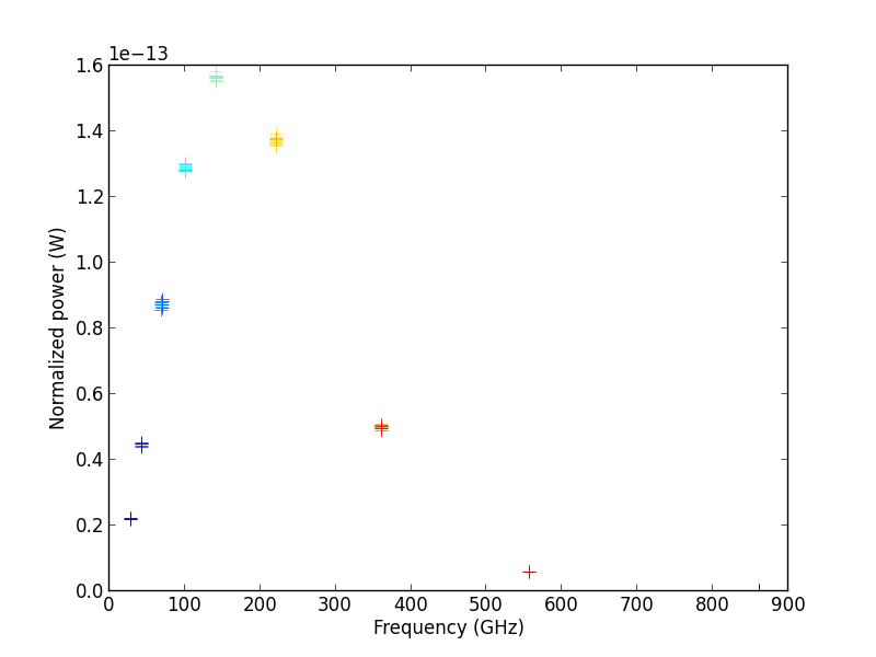
From any one of these data points, given the frequency and the measured power, you can calculate the temperature of the blackbody that produced it by starting with Planck’s law,
(\(\nu\) is the frequency), combining it with the definition of spectral radiance,
(\(A\) is the area of the satellite’s mirror, \(\Omega\) is the solid angle it sees at one time), and solving for temperature to get
With 74 separate simultaneous measurements, you can imagine that Planck is able to constrain the temperature of the CMB very precisely!
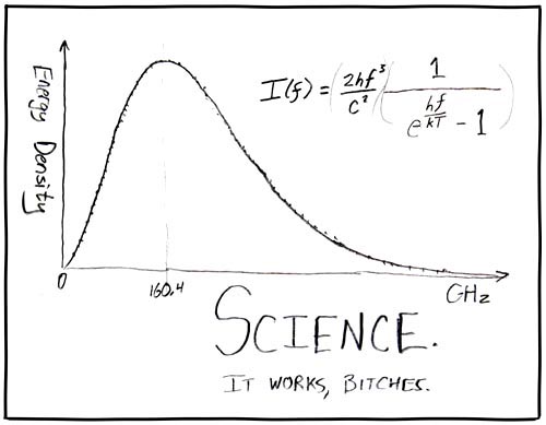
We’ve known for quite some time, since the COBE data presentation in 1990, that the CMB has an essentially perfect blackbody spectrum, with a temperature of \(\SI{2.72548+-0.00057}{K}\).
But we’ve also known for some time that the CMB isn’t exactly the same temperature in every direction. It varies by tiny fractions (thousandths) of a degree from one spot in the sky to another, so depending on which way you point the telescope, you’ll find a slightly different result. The objective of the Planck mission, like WMAP before it, is to measure these slight variations in temperature as precisely as possible.
The CMB power spectrum
One way to represent the temperature variations, or anisotropies, measured by Planck is a straightforward visualization, like this:
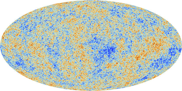
Every direction in space maps to a point in this image. Red areas indicate the directions in which Planck found the CMB to be slightly warmer than average (after accounting for radiation received from our galaxy and other known astronomical sources), and blue areas indicate the directions in which it was slightly cooler than average.
But for the scientific analysis of the CMB, it’s not actually that important to know exactly where in the sky the hot spots and cold spots are. These little anisotropies were generated by quantum fluctuations in the structure of spacetime in the very early universe, and quantum fluctuations are random. No theory can actually predict that you’ll have a hot spot in this particular direction and a cold spot in that particular direction. What you can predict is how the energy in the CMB should be distributed among various “modes.” Each mode is basically a pattern of hot and cold spots of a characteristic size.
Interlude: modes of a one-dimensional function
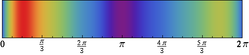
Modes are a lot easier to understand once you can visualize them, so let me explain the concept with a simple example. Here’s a plot of a function:
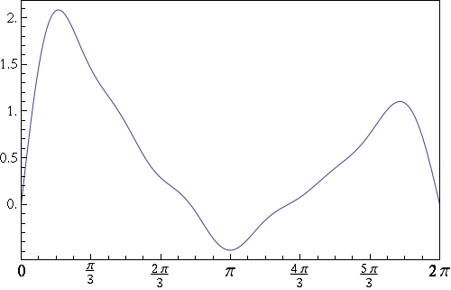
Actually, that graph is kind of boring. Here’s a more colorful way of visualizing the same function: a density map, which is red in the regions where the function is large and blue where it’s small:
If you’re familiar with Fourier analysis, you know that any function (more precisely: any periodic function on a finite interval of length \(L\)) can be expressed a sum of several sinusoidal functions with different wavelengths.
For this function, those are the 12 sine waves shown here:
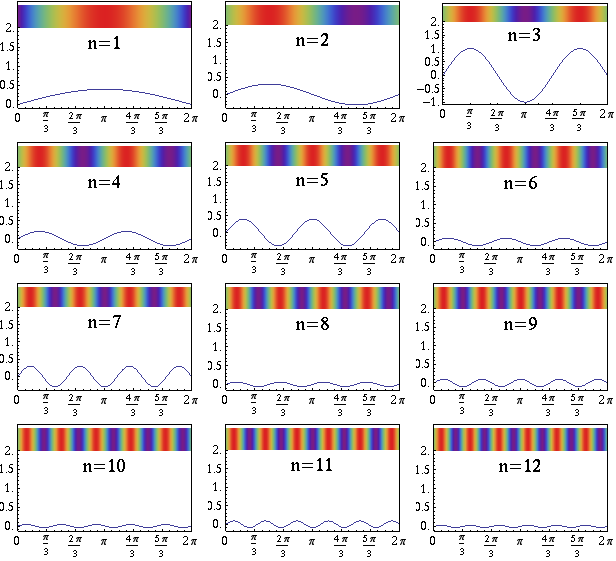
Each of these sine waves corresponds to a mode. We typically label them by the number of peaks and valleys in the wave, shown as \(n\) on each plot. If you look at the density maps, you can see that the modes with higher numbers have smaller hot (red) and cold (blue) spots, as I mentioned earlier.
Having broken down the original function into these sine waves, you can talk about how much energy is in each mode. The energy is related to the square of the sine wave’s amplitude. For example, the \(n = 3\) mode of this function has the most energy; \(n = 6\) and \(n = 8\) have relatively little. You can tell because the graph of the \(n = 3\) sine wave has the largest amplitude, and the \(n = 6\) and \(n = 8\) sine waves have small amplitudes. (The density maps don’t show the amplitudes.)
What a cosmological theory predicts is the amount of energy (per unit time) in each mode: the numbers \(C_n = \abs{f_n}^2\). This is called the power spectrum.
Modes on a sphere
We can do the same thing with the CMB that we did with the one-dimensional function in that example: break it down into individual modes, each with some amplitude, and determine how much energy is in each mode. Of course, the sky isn’t a line; it’s a sphere, which means the modes of the CMB are more complicated than just sine waves. Modes on a sphere are called spherical harmonics, and their density maps look like this:
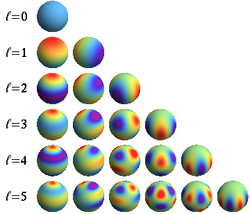
Because a sphere is a two-dimensional surface, it takes two numbers to index these modes, \(\ell\) and \(m\).
Any real-valued function on a sphere — like, say, the function which gives the temperature of the CMB in a given direction — can be expressed as a sum of real spherical harmonics, each scaled by some amplitude.
We can then go on to compute the power spectrum, just as in the 1D case. But it’s conventional to combine the power in all the modes with the same value of \(\ell\):
The numbers \(C_{\ell}\) constitute the power spectrum, analogous to \(C_n\) for the 1D function.
To the data!
Here’s the actual power spectrum measured by Planck, shown as red dots:

The quantity on the vertical axis is \(\frac{1}{2\pi}\ell(\ell + 1) C_\ell\). Beyond \(\ell = 10\) or so, each point represents an average over a few different values of \(\ell\). You don’t see points for \(\ell = 0\) or \(\ell = 1\) on the plot because the amplitude of the \(\ell = 0\) mode is just the average CMB temperature over the entire sky, which is probably skewed by sources of radiation local to our little corner of the universe, and the amplitude of the \(\ell = 1\) mode is primarily due to our motion relative to the CMB. So the meaningful physics starts at \(\ell = 2\).
At this point, I would love to dig into the models, and explain where some of those features in the power spectrum come from. But that will have to wait for another day. Stay tuned for the sequel to this post, coming soon, where I’ll talk about the physics that makes the CMB power spectrum what it is!