About saturation
Posted by David Zaslavsky on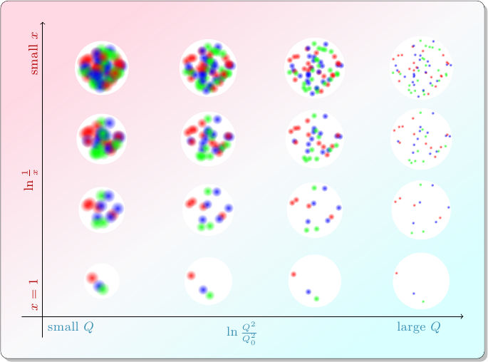
Time to kick off a new year of blog posts! For my first post of 2015, I’m continuing a series I’ve had on hold since nearly the same time last year, about the research I work on for my job. This is based on a paper my group published in Physical Review Letters and an answer I posted at Physics Stack Exchange.
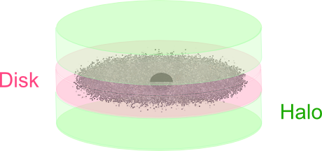
In the first post of the series, I wrote about how particle physicists characterize collisions between protons. A quark or gluon from one proton (the “probe”), carrying a fraction \(x_p\) of that proton’s momentum, smacks into a quark or gluon from the other proton (the “target”), carrying a fraction \(x_t\) of that proton’s momentum, and they bounce off each other with transverse momentum \(Q\). The target proton acts as if it has different compositions depending on the values of \(x_t\) and \(Q\): in collisions with smaller values of \(x_t\), the target appears to contain more partons.
At the end of the last post, I pointed out that something funny happens at the top left of this diagram. Maybe you can already see it: in these collisions with small \(x_t\) and small \(Q\), the proton …